Plenium – новый бренд косметических средств по уходу за кожей и предметов домашнего интерьера. Каждой девушке нужно время наедине с собой, вдали от повседневной суеты, чтобы зарядится энергией для дальнейших свершений. Название бренда происходит от слова «пленительный». Основная целевая аудитория бренда – девушки 27-35 лет, преимущественно креативного и бизнес класса. Косметика – это способ обрести life balance, позаботиться о себе и провести время наедине с собой вдали от повседневной суеты. Девушка, пользующаяся косметикой Plenium всегда ищет, как посмотреть на мир под другим углом, вдохновляется новыми формами и необычными сочетаниями.
Plenium is a new brand of cosmetic care products and home furnishings. Every girl needs time alone with herself, away from the daily bustle, to recharge her energy for further achievements. The name of the brand comes from the word "captivating. The main target audience of the brand is girls aged 27-35, mostly creative and business class. Cosmetics is a way to find life balance, to take care of yourself and to spend time alone with yourself away from the hustle and bustle of everyday life. A girl who uses Plenium cosmetics is always looking for ways to look at the world from a different angle, inspired by new shapes and unusual combinations.

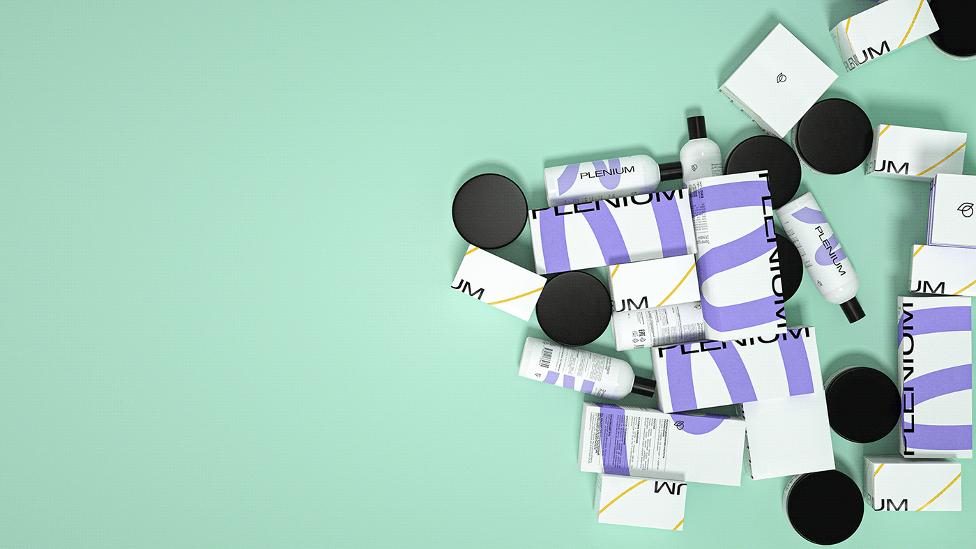
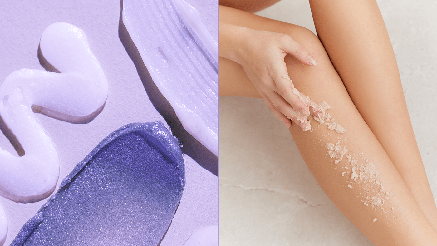
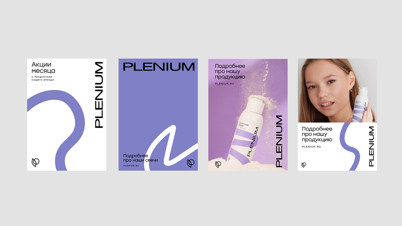
Любой женский ритуал начинается в ванной комнате. Это своего рода настоящий портал в атмсоферу ухода за собой. Девушка всегда проводит свои ритуалы напротив зеркала, которое в большинстве случаев запотевает от водных паров. Таким образом, характерное для каждого человека движение, протирающее запотевшее зеркало, легло в основую визуального языка. Яркая динамичная линия в сочетании со сторогой типографикой пролегает через все каналы коммуникации, принимает любые формы. Характер плавный, пастельных оттенков, отсылает к женской нежности и гибкости. Система предусматривает динамичность линии в зависимости от линейки продукции. Может изменяться цвет, форма, толщина, текстура линии.
Every woman's ritual begins in the bathroom. It is a kind of real portal to the atmsphere of self-care. A girl always performs her rituals in front of the mirror, which in most cases is fogged up by water vapor. Thus, the characteristic movement of wiping the fogged up mirror was the basis of the visual language. The bright dynamic line combined with the side typography runs through all channels of communication, takes all forms. The character is smooth, pastel shades, referring to the feminine tenderness and flexibility. The system provides for a dynamic line depending on the product line. The color, shape, thickness, texture of the line can change.